A feature-rich data table and view management component registry for shadcn/ui.
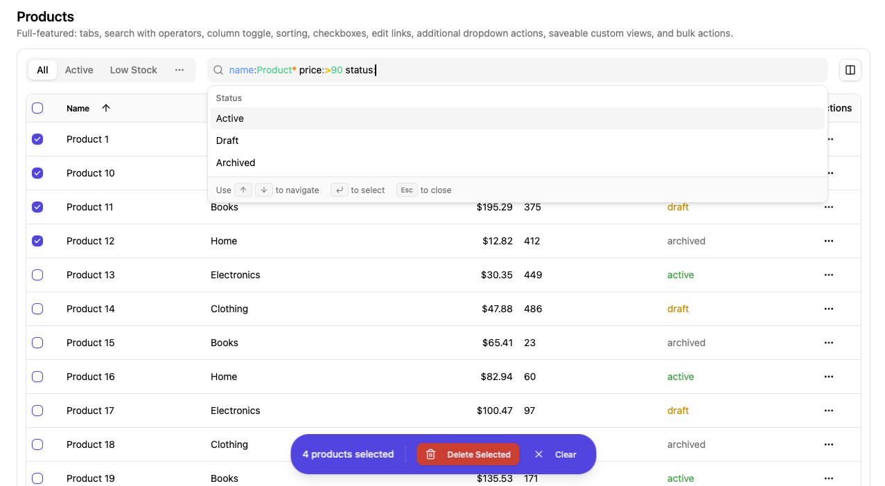
- Sortable tables with pagination and remote/XHR content loading
- Column visibility controls
- Predefined and custom saveable views
- Structured search with field suggestions, syntax highlighting, and query builder
- Floating bulk actions bar with row checkboxes, select all, and shift-click support
npx shadcn@latest add https://raw.githubusercontent.com/chrisboulton/shadcn-components-table-view/main/public/r/table-view.jsonOr install individual components:
npx shadcn@latest add https://raw.githubusercontent.com/chrisboulton/shadcn-components-table-view/main/public/r/data-table.json
npx shadcn@latest add https://raw.githubusercontent.com/chrisboulton/shadcn-components-table-view/main/public/r/view-manager.json
npx shadcn@latest add https://raw.githubusercontent.com/chrisboulton/shadcn-components-table-view/main/public/r/search-command.jsonSortable table with pagination, row selection (with shift-click range selection), inline action buttons, and a dropdown actions menu.
<DataTable
  data={listResponse}
  columns={columns}
  columnConfig={columnConfig}
  selectedItems={selectedIds}
  onSelectionChange={setSelectedIds}
  onPageChange={setPage}
  onSortChange={(field, order) => setSort({ field, order })}
  onItemsPerPageChange={setPerPage}
  sortBy="name"
  sortOrder="asc"
  loading={isLoading}
  itemName="customers"
  getItemId={(item) => item.id}
  getItemDisplayName={(item) => item.name}
  renderEditLink={(item) => (
    <DropdownMenuItem asChild>
      <Link to={`/customers/${item.id}`}><Edit className="mr-2 h-4 w-4" />Edit</Link>
    </DropdownMenuItem>
  )}
  inlineActions={[
    { id: 'view', icon: Eye, label: 'View', onClick: (item) => navigate(`/customers/${item.id}`) },
  ]}
/>| Prop | Type | Default | Description |
|---|---|---|---|
data |
ListResponse<T> |
— | Page-based response with data, total, page, per_page, total_pages |
columns |
DataTableColumn<T>[] |
— | Column definitions with id, label, optional render function |
columnConfig |
ColumnConfig[] |
— | Column visibility configuration |
selectedItems |
string[] |
[] |
Array of selected item IDs |
onSelectionChange |
(ids: string[]) => void |
— | Called when selection changes |
onEdit |
(item: T) => void |
— | Edit handler (shown in dropdown menu) |
onDelete |
(itemId: string) => void |
— | Delete handler (shown in dropdown menu) |
onPageChange |
(page: number) => void |
— | Required. Page change handler |
onSortChange |
(field: TSortField, order: 'asc' | 'desc') => void |
— | Sort change handler |
onItemsPerPageChange |
(itemsPerPage: number) => void |
— | Items per page change handler |
sortBy |
TSortField |
— | Current sort field |
sortOrder |
'asc' | 'desc' |
— | Current sort direction |
loading |
boolean |
false |
Show loading spinner |
itemName |
string |
— | Required. Plural noun for display (e.g. "customers") |
getItemId |
(item: T) => string |
— | Required. Extract unique ID from row item |
getItemDisplayName |
(item: T) => string |
— | Extract display name (used in aria labels) |
additionalActions |
(item: T) => ReactNode |
— | Extra dropdown menu items per row |
renderEditLink |
(item: T) => ReactNode |
— | Custom edit link (replaces default onEdit in dropdown) |
inlineActions |
InlineAction<T>[] |
— | Buttons rendered directly in the actions cell |
hideDropdownActions |
boolean |
false |
Hide the "..." dropdown menu entirely |
showCheckboxes |
boolean |
true |
Show row selection checkboxes |
showSorting |
boolean |
true |
Show sortable column headers |
Tabbed view switcher with integrated search, column toggle dropdown, and optional saved custom views (via a pluggable adapter).
<ViewManager
  currentView={currentView}
  builtInViews={views}
  searchQuery={searchQuery}
  searchFields={searchFields}
  entity="customers"
  storeId="store-1"
  onViewChange={setCurrentView}
  onSearchChange={setSearchQuery}
  onColumnToggle={handleColumnToggle}
  savedViewsAdapter={myAdapter}
/>| Prop | Type | Default | Description |
|---|---|---|---|
currentView |
DataView<TSortField> |
— | Required. Active view |
builtInViews |
DataView<TSortField>[] |
— | Required. Predefined views |
searchQuery |
string |
— | Required. Current search query |
searchFields |
SearchField[] |
— | Required. Fields available in the search command palette |
entity |
string |
— | Required. Entity type (e.g. "customers") |
storeId |
string |
— | Required. Store identifier |
onViewChange |
(view: DataView<TSortField>) => void |
— | Required. Called when the active view changes |
onSearchChange |
(query: string) => void |
— | Required. Called when search query changes |
onColumnToggle |
(columnId: string) => void |
— | Required. Called when a column is toggled |
showSearch |
boolean |
true |
Show the search bar |
showAllViewsInTabs |
boolean |
false |
Show all views as tabs (instead of first 2 + overflow dropdown) |
allowCustomViews |
boolean |
true |
Enable "Save view" functionality |
showColumnToggle |
boolean |
true |
Show column visibility dropdown |
savedViewsAdapter |
SavedViewsAdapter |
— | Adapter for CRUD on saved views. Custom views are disabled when omitted. |
Command palette for structured search queries with field suggestions, value autocomplete, recent search history, and syntax tips.
| Prop | Type | Default | Description |
|---|---|---|---|
searchFields |
SearchField[] |
— | Required. Available search fields |
searchQuery |
string |
— | Required. Current query string |
recentSearches |
string[] |
— | Required. Recent search history |
onQueryChange |
(query: string) => void |
— | Required. Called when the query changes |
onSelectField |
(field: SearchField) => void |
— | Required. Called when a field is selected |
onSelectValue |
(value: string, operator?: string) => void |
— | Required. Called when a value is selected |
onSelectSuggestion |
(query: string) => void |
— | Required. Called when a recent search is selected |
onSubmit |
() => void |
— | Required. Called on Enter |
enableHighlight |
boolean |
true |
Enable syntax highlighting in the input |
A cmdk CommandInput wrapper that renders a transparent overlay with syntax-highlighted tokens. Used internally by SearchCommand.
| Prop | Type | Default | Description |
|---|---|---|---|
value |
string |
— | Input value |
onValueChange |
(value: string) => void |
— | Value change handler |
enableHighlight |
boolean |
false |
Enable syntax highlighting overlay |
knownAttributeFields |
string[] |
— | Attribute field names to highlight (without @ prefix) |
className |
string |
— | Additional CSS class |
Also accepts all props from cmdk's CommandInput (e.g. placeholder, onFocus, onBlur, onKeyDown).
Fixed-position floating bar that appears when rows are selected. Renders action buttons and a clear selection button.
<BulkActionsBar
  selectedCount={selectedIds.length}
  actions={[
    { icon: Mail, label: 'Email', onClick: handleBulkEmail },
    { icon: Trash2, label: 'Delete', onClick: handleBulkDelete, variant: 'destructive' },
  ]}
  onClearSelection={() => setSelectedIds([])}
  itemName="customers"
/>| Prop | Type | Default | Description |
|---|---|---|---|
selectedCount |
number |
— | Required. Number of selected items. Bar is hidden when 0. |
actions |
BulkAction[] |
— | Required. Action buttons |
onClearSelection |
() => void |
— | Required. Called when "Clear" is clicked |
itemName |
string |
— | Noun for display (e.g. "3 customers selected") |
interface BulkAction {
  icon: LucideIcon
  label: string
  onClick: () => void
  variant?: 'default' | 'secondary' | 'destructive' | 'outline' | 'ghost'
}Pagination controls with page numbers, prev/next, items-per-page selector, and "Showing X-Y of Z" text. Used internally by DataTable.
| Prop | Type | Default | Description |
|---|---|---|---|
currentPage |
number |
— | Required. Current page (1-indexed) |
totalPages |
number |
— | Required. Total number of pages |
onPageChange |
(page: number) => void |
— | Required. Page change handler |
totalItems |
number |
— | Required. Total item count |
itemsPerPage |
number |
— | Required. Items per page |
onItemsPerPageChange |
(itemsPerPage: number) => void |
— | Items per page change handler. When provided, shows a page size selector. |
itemName |
string |
"items" |
Noun for display text |
All hooks accept a SavedViewsAdapter (or an extended adapter) as a parameter — no hardcoded API layer.
Fetch saved views for an entity.
function useSavedViews(
  entity: SavedViewEntity,
  adapter: SavedViewsAdapter,
  options?: Omit<UseQueryOptions<SavedView[]>, 'queryKey' | 'queryFn'>,
): UseQueryResult<SavedView[]>Fetch a single saved view by ID. Requires an adapter with a get method.
function useSavedView(
  id: string,
  adapter: SavedViewsAdapter & { get?: (id: string) => Promise<SavedView> },
  options?: Omit<UseQueryOptions<SavedView>, 'queryKey' | 'queryFn'>,
): UseQueryResult<SavedView>function useCreateSavedView(
adapter: SavedViewsAdapter,
): UseMutationResult<SavedView, Error, CreateSavedViewRequest>Requires an adapter with an update method.
function useUpdateSavedView(
  adapter: SavedViewsAdapter & {
    update?: (id: string, data: UpdateSavedViewRequest) => Promise<SavedView>
  },
): UseMutationResult<SavedView, Error, { id: string; data: UpdateSavedViewRequest }>function useDeleteSavedView(
adapter: SavedViewsAdapter,
): UseMutationResult<{ id: string; entity: SavedViewEntity }, Error, { id: string; entity: SavedViewEntity }>Page-based paginated response expected by DataTable.
interface ListResponse<T> {
  data: T[]
  total: number
  page: number         // 1-indexed
  per_page: number
  total_pages: number
  sort?: string
  order?: 'asc' | 'desc'
}Represents a named table view with filters, sort, and column configuration.
interface DataView<TSortField = string> {
  id: string
  name: string
  description?: string
  isBuiltIn: boolean
  filters: ViewFilter
  sort: { field: TSortField; order: 'asc' | 'desc' }
  columns: ColumnConfig[]
}Column definition for DataTable.
interface DataTableColumn<T = any> {
  id: string
  label: string
  sortable?: boolean
  render?: (item: T) => React.ReactNode
  className?: string
}Column visibility entry (used in DataView.columns and passed to DataTable.columnConfig).
interface ColumnConfig {
  id: string
  label: string
  visible: boolean
  width?: string
}Describes a field available for search. Supports text, boolean, date, number, and combobox types.
interface SearchField {
  id: string            // Use "@attr" prefix for attribute fields
  label: string
  type: 'text' | 'boolean' | 'date' | 'number' | 'combobox'
  operators?: string[]
  options?: { value: string; label: string }[]
  searchCallback?: (storeId: string, searchTerm: string) => Promise<Array<{ id: string; name: string }>>
}An action rendered as a button directly in the row's actions cell.
interface InlineAction<T = any> {
  id: string
  icon: React.ComponentType<{ className?: string }>
  label: string
  showLabel?: boolean   // default: false
  onClick: (item: T) => void
  disabled?: (item: T) => boolean
  variant?: 'default' | 'secondary' | 'outline' | 'ghost' | 'destructive'
  className?: string
}interface ViewFilter {
search: string
[key: string]: any
}Persisted view returned by the adapter.
interface SavedView {
  id: string
  name: string
  entity: SavedViewEntity     // string
  visible_by: SavedViewVisibility  // 'everyone' | 'owner'
  search_query?: string
  sort_by: string
  sort_direction: 'asc' | 'desc'
  columns: string[]
  per_page: number
}Pluggable persistence interface. Implement this to connect saved views to your API.
interface SavedViewsAdapter {
  list: (entity: string) => Promise<SavedView[]>
  create: (data: CreateSavedViewRequest) => Promise<SavedView>
  delete: (id: string) => Promise<void>
}
Optionally extend with get and update for useSavedView / useUpdateSavedView:
interface ExtendedAdapter extends SavedViewsAdapter {
  get: (id: string) => Promise<SavedView>
  update: (id: string, data: UpdateSavedViewRequest) => Promise<SavedView>
}Convert between offset-based API responses and the page-based ListResponse format.
transformToListResponse<T>(response: OffsetPaginationResponse<T>): ListResponse<T>
pageToOffset(page: number, perPage: number): number
offsetToPage(offset: number, perPage: number): number
OffsetPaginationResponse<T> shape:
{ data: T[], pagination: { total: number, limit: number, offset: number, has_more: boolean } }LocalStorage-backed per-entity search history (max 10 items).
getSearchHistory(entity: string): string[]
addToSearchHistory(entity: string, query: string): void
clearSearchHistory(entity: string): void
removeFromSearchHistory(entity: string, query: string): voidParse and manipulate structured field:value queries.
parseSearchQuery(query: string, cursorPosition: number): ParseResult
buildFilterString(field: string, value: string, operator?: string): string
updateQueryWithFilter(query: string, cursorPosition: number, filterString: string): { query: string; cursorPosition: number }Tokenize queries for syntax-highlighted rendering.
tokenizeForHighlight(query: string, knownAttributeFields?: string[]): HighlightToken[]
getTokenClassName(type: TokenType): string
Token types: field, colon, operator, value, keyword, paren, wildcard, text.
The search system supports structured queries with the following syntax:
| Syntax | Example | Description |
|---|---|---|
field:value |
name:John |
Exact match |
field:*value* |
email:*@gmail.com |
Wildcard (contains, starts/ends with) |
field:>value |
score:>90 |
Greater than (also <, >=, <=, =) |
field:>date |
created_at:>2024-01-01 |
Date comparison |
field:"val ue" |
name:"John Doe" |
Quoted value with spaces |
@attr:value |
@plan:enterprise |
Attribute field |
AND / OR / NOT |
name:John AND status:active |
Boolean operators |
( ) |
(name:John OR name:Jane) AND active:true |
Grouping |
-field:value |
-status:archived |
Negation |
import {
  DataTable,
  ViewManager,
  BulkActionsBar,
  type DataView,
  type ListResponse,
  type DataTableColumn,
  type SearchField,
} from 'shadcn-table-view'

function CustomersPage() {
  const [currentView, setCurrentView] = useState<DataView>(builtInViews[0])
  const [searchQuery, setSearchQuery] = useState('')
  const [selectedIds, setSelectedIds] = useState<string[]>([])
  const [page, setPage] = useState(1)

  const views: DataView[] = [
    {
      id: 'all',
      name: 'All Customers',
      isBuiltIn: true,
      filters: { search: '' },
      sort: { field: 'name', order: 'asc' },
      columns: [
        { id: 'name', label: 'Name', visible: true },
        { id: 'email', label: 'Email', visible: true },
        { id: 'status', label: 'Status', visible: true },
      ],
    },
  ]

  const searchFields: SearchField[] = [
    { id: 'name', label: 'Name', type: 'text' },
    { id: 'email', label: 'Email', type: 'text' },
    { id: 'status', label: 'Status', type: 'combobox', options: [
      { value: 'active', label: 'Active' },
      { value: 'inactive', label: 'Inactive' },
    ]},
  ]

  const columns: DataTableColumn<Customer>[] = [
    { id: 'name', label: 'Name', sortable: true },
    { id: 'email', label: 'Email', sortable: true },
    { id: 'status', label: 'Status', render: (item) => <Badge>{item.status}</Badge> },
  ]

  return (
    <>
      <ViewManager
        currentView={currentView}
        builtInViews={views}
        searchQuery={searchQuery}
        searchFields={searchFields}
        entity="customers"
        storeId="store-1"
        onViewChange={setCurrentView}
        onSearchChange={setSearchQuery}
        onColumnToggle={(id) => {/* toggle column visibility */}}
        savedViewsAdapter={mySavedViewsAdapter}
      />
      <DataTable
        data={data}
        columns={columns}
        columnConfig={currentView.columns}
        selectedItems={selectedIds}
        onSelectionChange={setSelectedIds}
        onPageChange={setPage}
        onSortChange={(field, order) => {/* update sort */}}
        itemName="customers"
        getItemId={(item) => item.id}
      />
      <BulkActionsBar
        selectedCount={selectedIds.length}
        actions={[
          { icon: Mail, label: 'Email', onClick: () => {/* bulk email */} },
          { icon: Trash2, label: 'Delete', onClick: () => {/* bulk delete */}, variant: 'destructive' },
        ]}
        onClearSelection={() => setSelectedIds([])}
        itemName="customers"
      />
    </>
  )
}<ViewManager
currentView={currentView}
builtInViews={views}
searchQuery={searchQuery}
searchFields={searchFields}
entity="orders"
storeId="store-1"
onViewChange={setCurrentView}
onSearchChange={setSearchQuery}
onColumnToggle={handleColumnToggle}
allowCustomViews={false}
/>
<DataTable
data={data}
columns={columns}
columnConfig={currentView.columns}
onPageChange={setPage}
itemName="orders"
getItemId={(item) => item.id}
showCheckboxes={false}
hideDropdownActions
inlineActions={[
{ id: 'view', icon: Eye, label: 'View', onClick: (item) => navigate(`/orders/${item.id}`) },
]}
/><DataTable
data={data}
columns={[
{ id: 'name', label: 'Name', sortable: true },
{ id: 'email', label: 'Email' },
]}
columnConfig={[
{ id: 'name', label: 'Name', visible: true },
{ id: 'email', label: 'Email', visible: true },
]}
onPageChange={setPage}
onSortChange={setSortField}
sortBy={sortBy}
sortOrder={sortOrder}
itemName="users"
getItemId={(item) => item.id}
showCheckboxes={false}
hideDropdownActions
/>- React 19+, Tailwind CSS v4, shadcn/ui
@tanstack/react-query(foruseSavedViewshooks)
npm install
npm run dev          # Start example at localhost:5173
npm run typecheck    # Type checking
npm run lint         # ESLint
npm run registry:build # Build registry JSON filesMIT